The problem
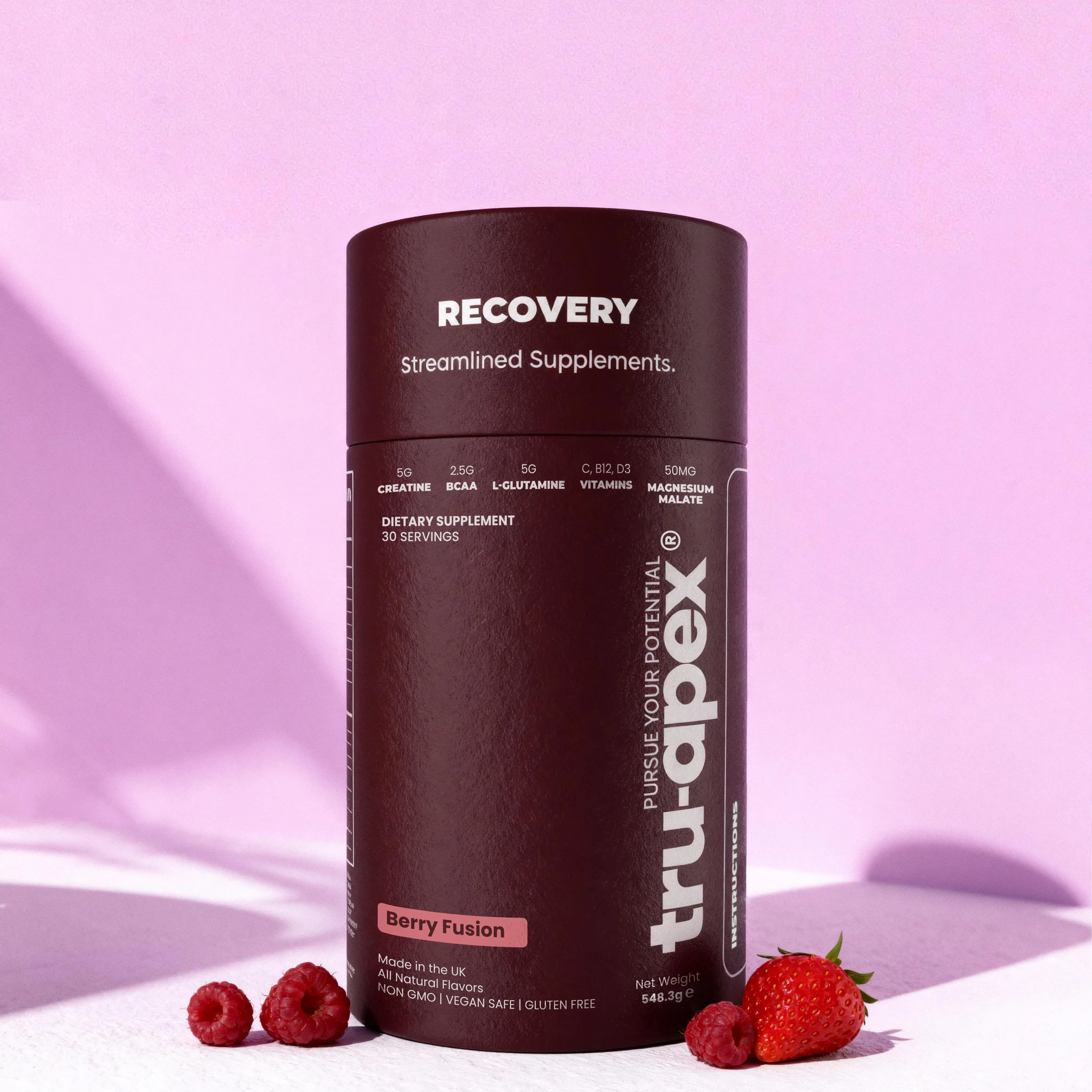
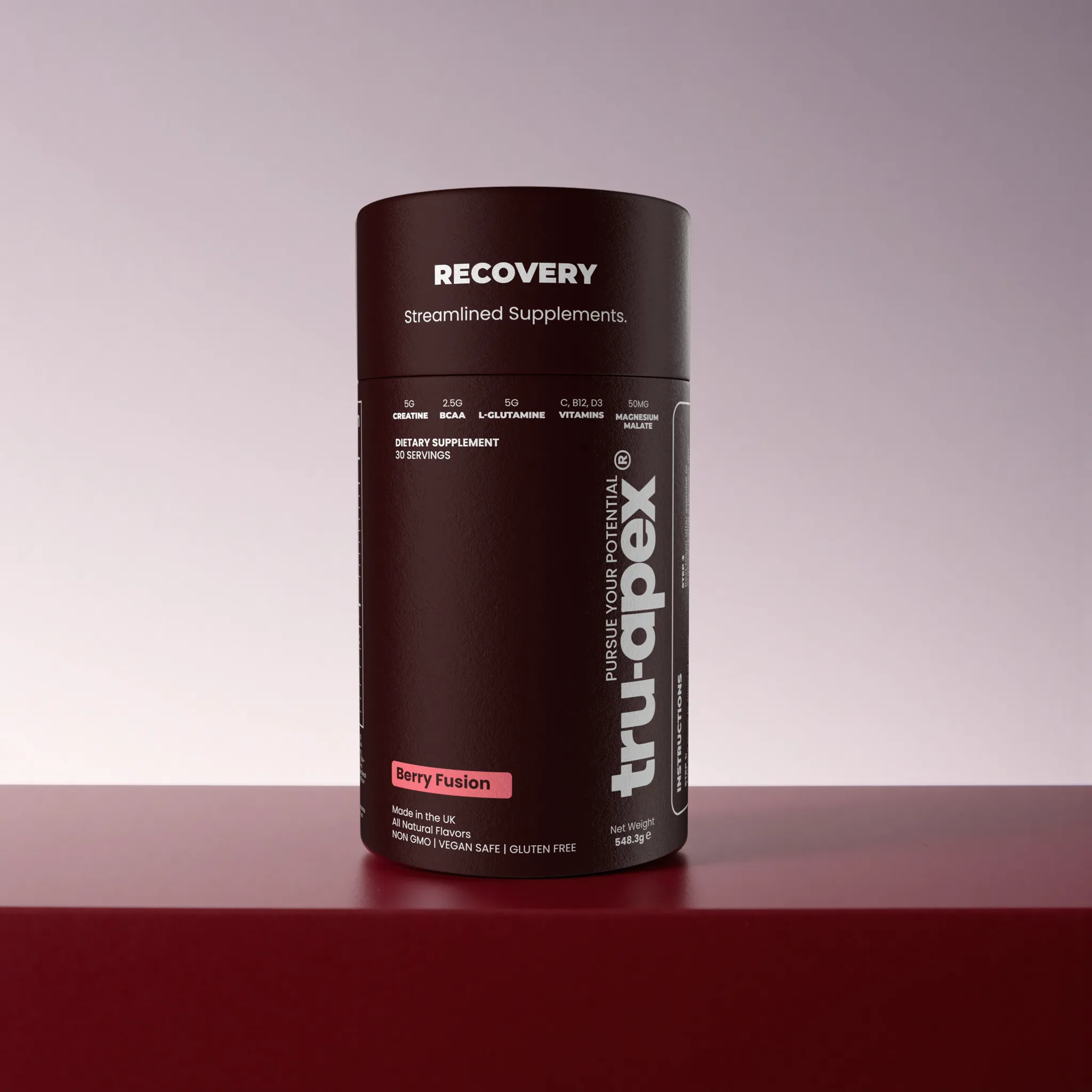
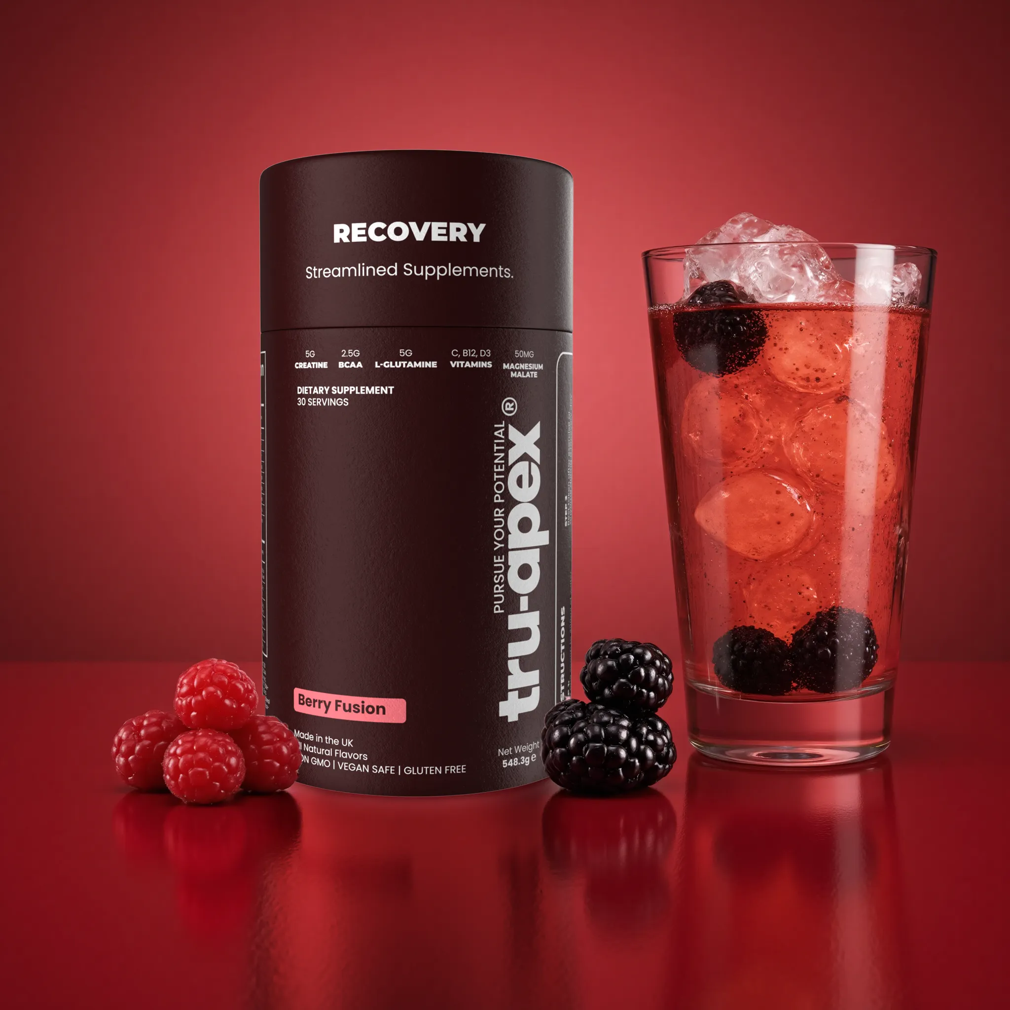
Tru-Apex wanted an iconic brand for all genders, skewed toward a male audience who trains, values aesthetics, and cares about self-improvement. The pack had to feel sleek and sporty — and make product attributes obvious on the front.
The range
What we redesigned
- 01
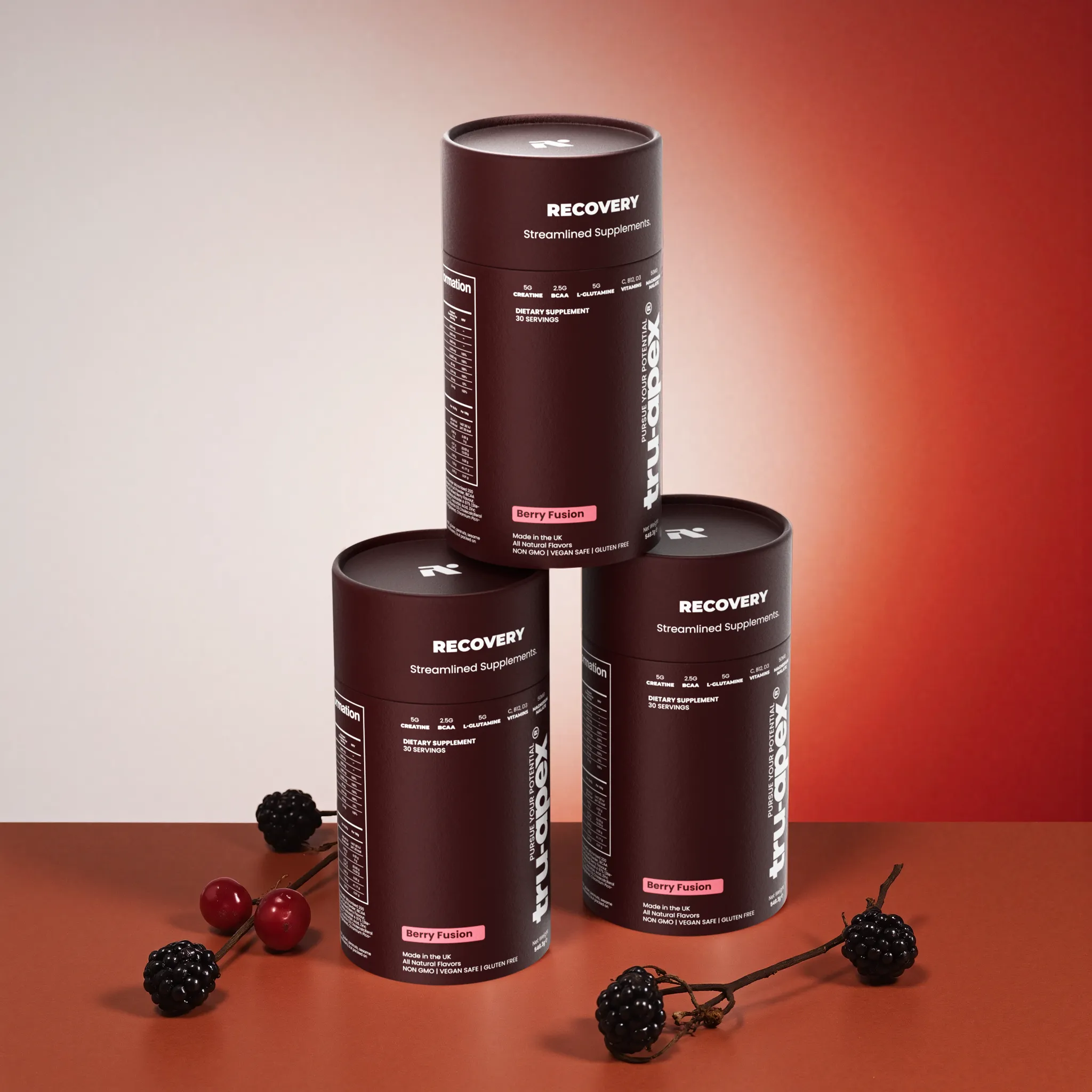
Settled on a deep burgundy red uncommon in the space, so the brand owns a distinct lane.
- 02
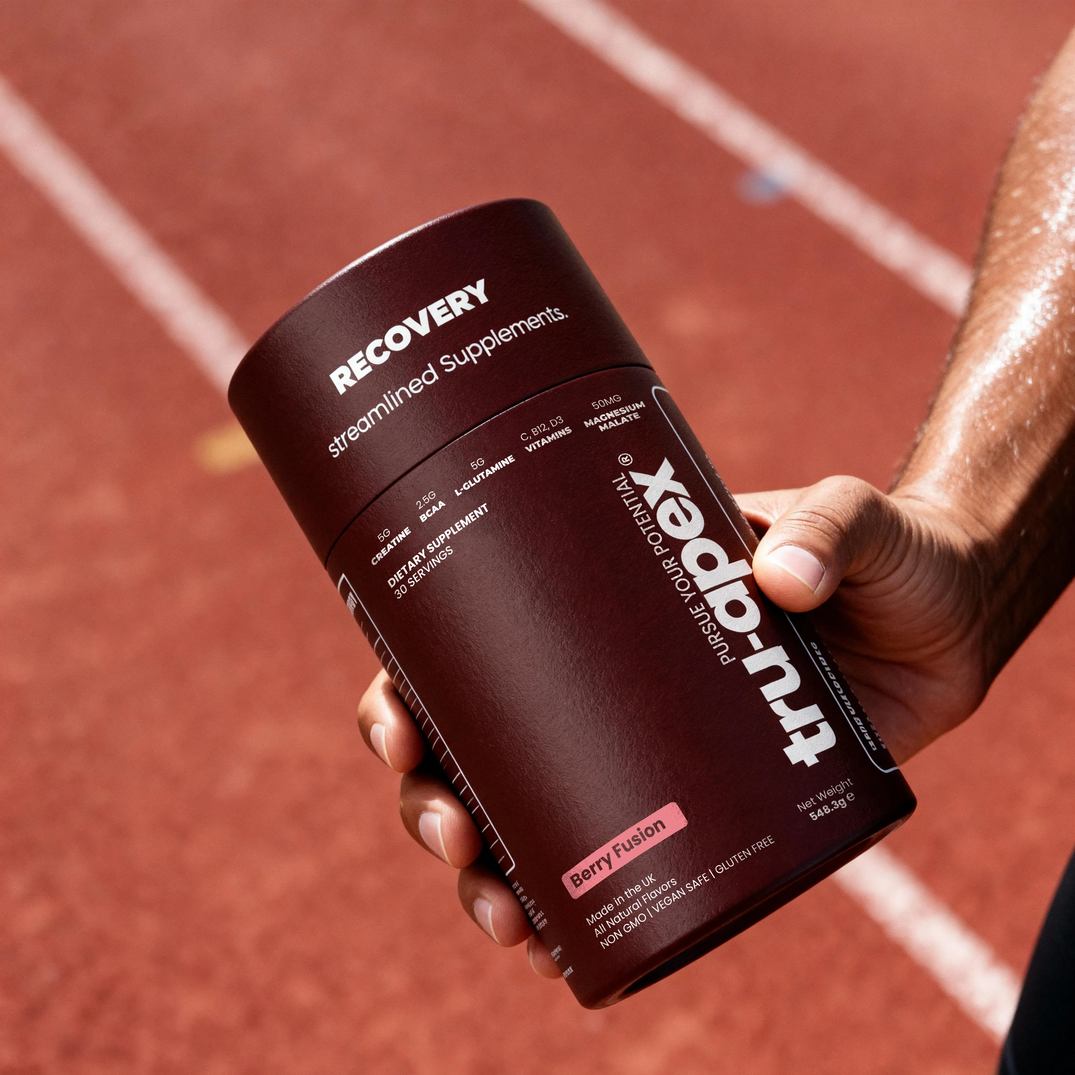
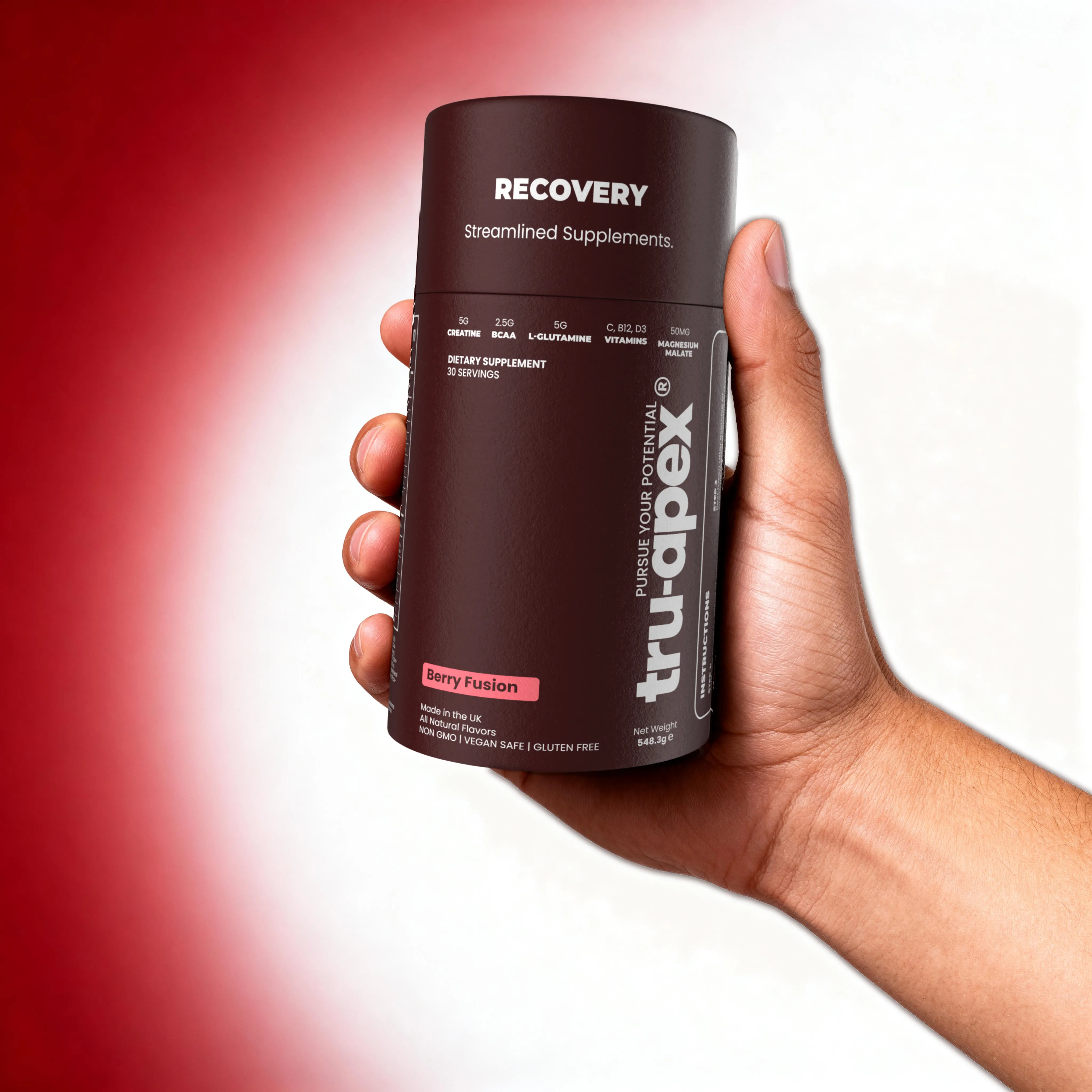
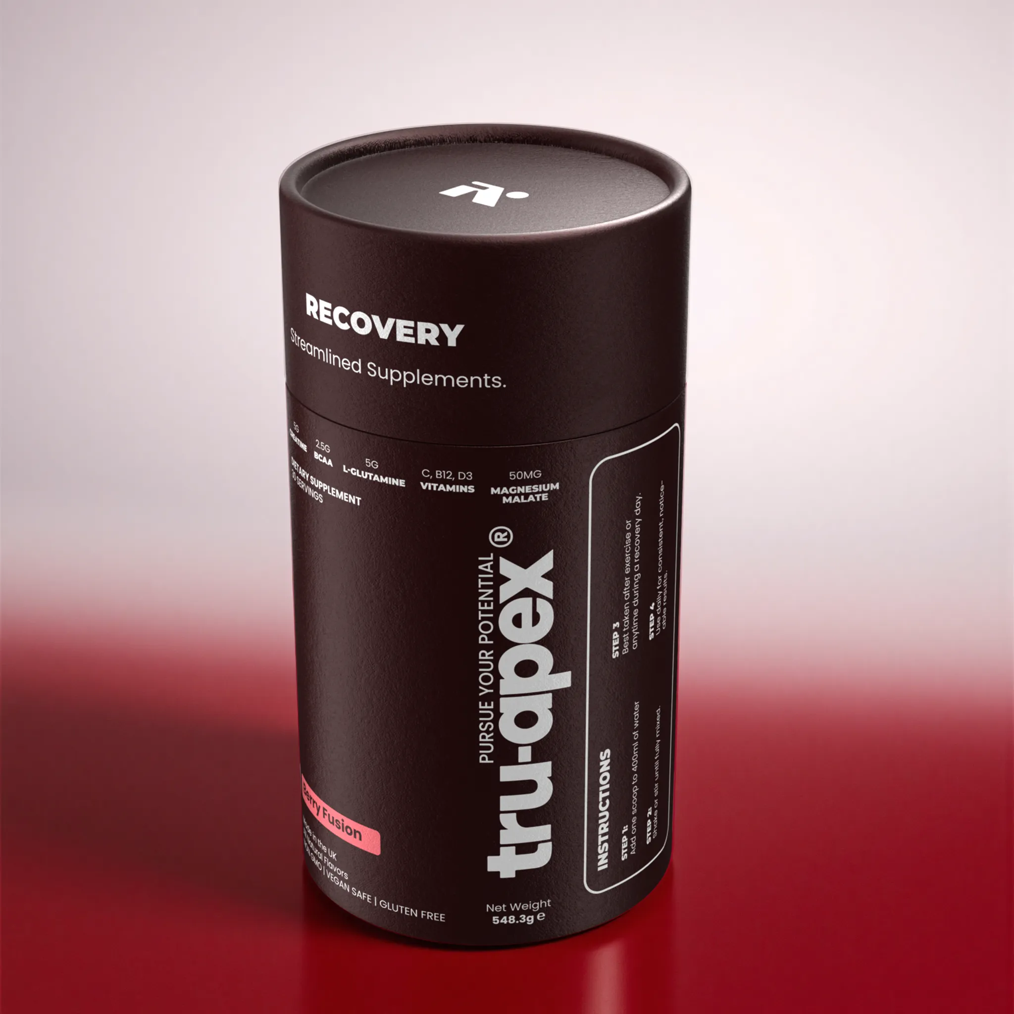
Built packaging with a sleek, sporty feel that matches how the audience sees themselves.
- 03
Put product attributes clearly on the front so customers can identify with the product at a glance.
- 04
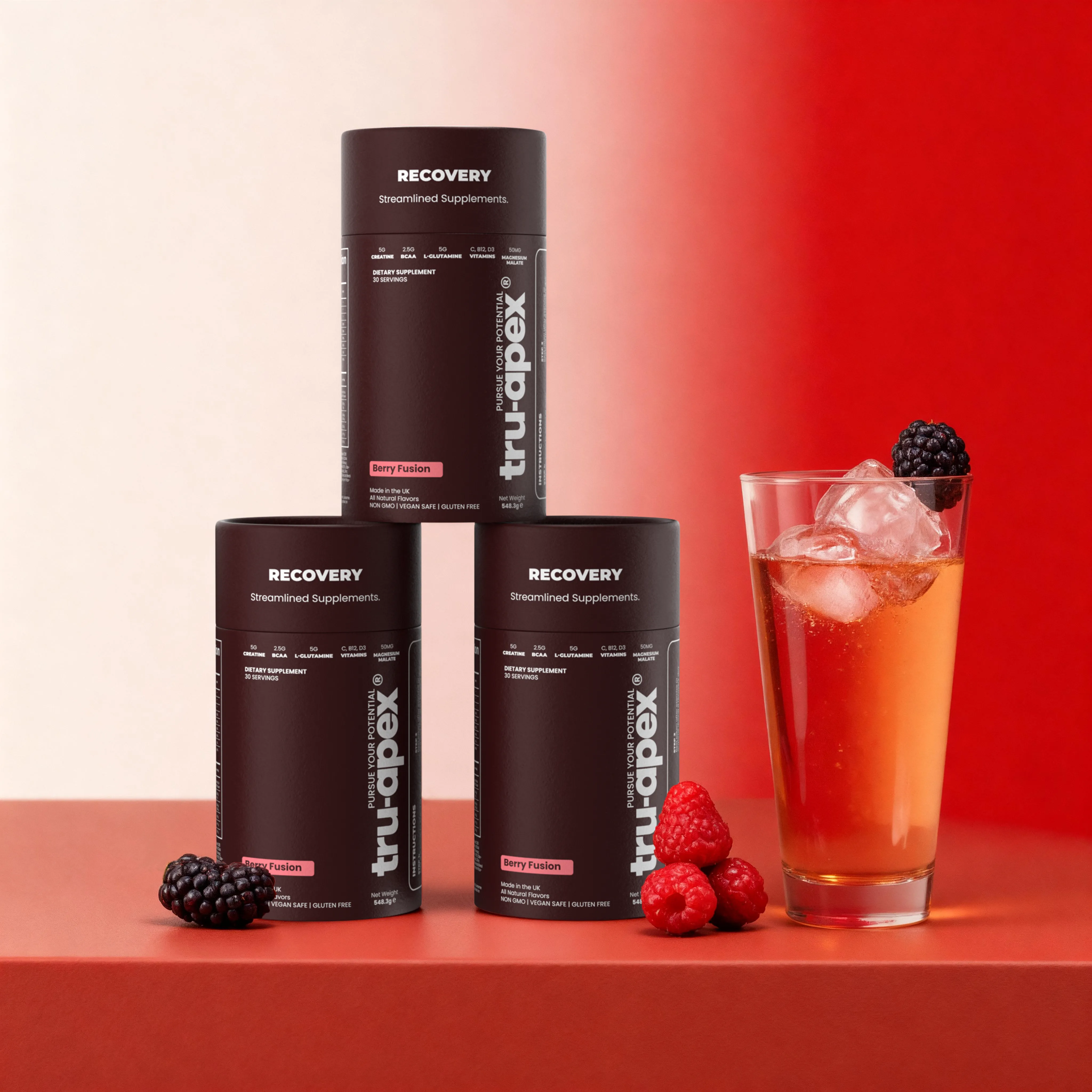
Designed a single hero SKU system strong enough to carry brand recognition.
Why it worked
Performance nutrition often defaults to neon and cliché gym cues. Tru-Apex needed something more refined — aesthetic enough for self-improvement culture, clear enough that attributes read instantly.
Scope
- ·Brand identity direction
- ·Packaging design
- ·Attribute-led front panel
The system
Packaging in context.
Outcome
The work
SKUs designed
Color system
Audience
Free strategy call
Want to talk through what this could look like for your brand?
Book a 30-minute call to pressure-test priorities, constraints, and next steps.